Brand Guidelines
This is the home of the World Space Week Brand Guidelines. Here you will find the resources needed to keep all extensions of our brand looking and feeling cohesive.
Consistency is paramount within strong brands because it enforces memorability and builds trust within our global network of participants. Stay within these guidelines when generating new assets, whether visual or written, and World Space Week’s brand will continue to shine.
Brand Guidelines
Brand Lens
Always keep in mind why we do what we do, what we stand for, and how we speak to the world.
The mission of World Space Week Association (WSWA) is to strengthen the link between space and society through public education, participation, and dialogue on the future of space activity using World Space Week as a focus.
What do we stand for?
Inclusivity
- All ages, nationalities, genders and backgrounds should feel included, from students in developing countries to heads of space agencies.
- All types of space events are welcome, from protests to star-gazing parties.
Synergy
The true power of WSW is in thousands of events being held simultaneously all over the world.
Linking space and humanity
- Humans are inherently connected to space.
- Space is “useful for humankind”.
– Max Grimard, Chairman - We inspire and excite the world about space science.
In what ways should we communicate?
Powerful
Our identity should reinforce the powerful experience that participating in a global space event provides our participants.
Sophisticated
For WSW to grow we need to build trust in our event. We should appear seasoned and sophisticated when participants new and old engage with our brand.
Inspirational
Our identity should leave attendees feeling bright, open, inspired to engage in a life of science – and to continue looking up.
Logo
Our logo is the keystone to our visual brand. It is our calling card. It’s imperative that all over the world, all participants use the same logo with minimal variation so that the world knows who’s calling.
Download logos with dates
Download logos for all countries
Browse logo directory
Stacked

Symbol

Wordmark

Long form

Logo descriptor
Our logo always appears paired with a descriptor alongside the words ‘World Space Week’. When referencing a country, the name of the country is used as the descriptor. When referencing an organization, the organization name is used, and so on. When talking about the event in a general sense, the dates of the event, October 4-10, are used. This is the baseline format of the World Space Week Logo.

Make your own logo
Download templateLogo Construction
Our logo has cosmic origins. Its proportions are derived from a ratio based on the actual sizes of the earth and moon when placed adjacent to one another.

Minimum size
At certain sizes all logos become illegible. Avoid shrinking our logo beyond this scale to achieve the best results.
Digital

If space is limited (e.g., in the case of social media), consider using our symbol on its own.
Clear Space
Just like everybody else, our logo needs room to breathe. Squeezing our logo up against other elements compromises its integrity and can create visual clutter. At all costs, adhere to these spatial guidelines.
Stacked

Symbol

Wordmark

Long form

Do’s & Don’ts
Consistency is one of the most important guidelines we can adhere to. Under no circumstances should our logo be altered beyond what’s outlined below.
Yes
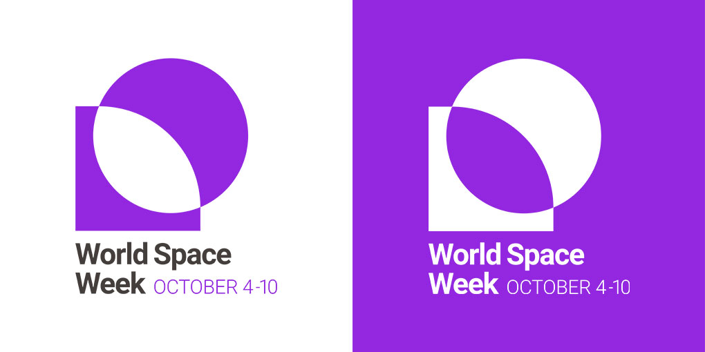
- Use the full color logo on light backgrounds
- Use a white logo on dark backgrounds
- Use Gammagenta as the background color if possible
- Maintain legibility & clear space
No
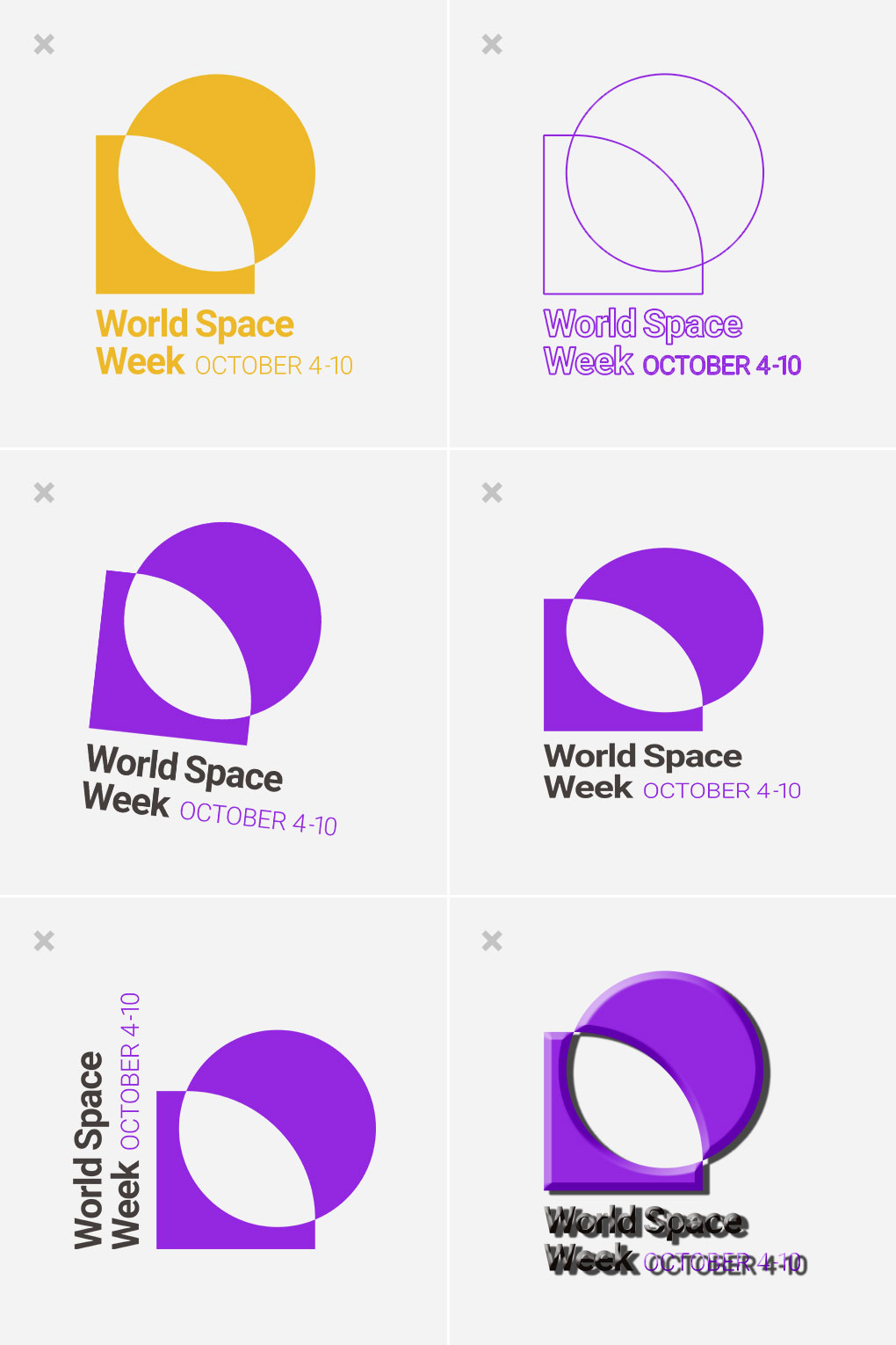
- Don’t add new colors or effects
- Don’t rotate, skew, or warp
- Don’t alter hierarchy or sizing
Colors
The color of our logo represents the energy created by people all over the world simultaneously celebrating space.
Gammagenta
| Hex: | #9327e0 |
|---|---|
| RGB: | 147-39-224 |
| CMYK: | 34-83-0-12 |
| Pantone: | 7442 C |
Meteorite
| Hex: | #443e3c |
|---|---|
| RGB: | 68-62-60 |
| CMYK: | 64-62-62-49 |
| Pantone: | Black 7 C |
Our primary color is Gammagenta. Use it in large doses so we continue to own it as our main color. Our secondary color, Meteorite, should be used to underline and support Gammagenta at a ratio of about 4:1.
Typography
Our primary typeface is Roboto. A simple, familiar yet bold sans serif to provide maximum accessibility to our audience.
Download Fonts
Roboto Bold
ABCDEFGHIJKLMNOPQRSTUVWXYZ
abcdefghijklmnopqrstuvwxyz
0123456789+-/&$%#?!
Roboto Bold is our display font. Use it for titles and headings and large exclamations.
Roboto Light
ABCDEFGHIJKLMNOPQRSTUVWXYZ
abcdefghijklmnopqrstuvwxyz
0123456789+-/&$%#?!
Roboto Light is our secondary heading font. Use it to add in additional messages, sub-headers or notes.
Roboto Regular
ABCDEFGHIJKLMNOPQRSTUVWXYZ
abcdefghijklmnopqrstuvwxyz
0123456789+-/&$%#?!
Roboto Regular is our body font. Use it for paragraphs or big chunks of text.
Collateral
Signage
Business Cards
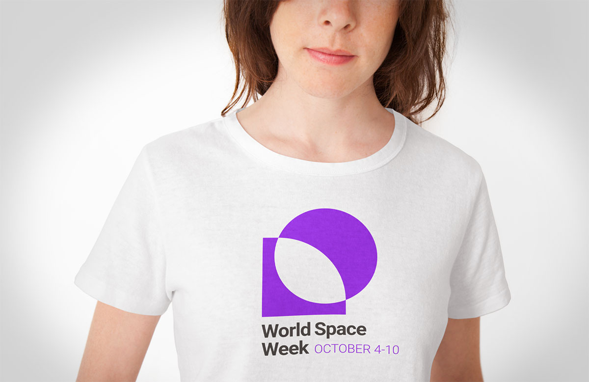
Apparel
Social Media