With 3500 events happening globally each year, World Space Week is the largest space event on Earth. The goal of the event is to strengthen the link between space and society through public education, participation, and dialogue on the future of space activities – and with over 80 participating nations, they’re well on their way. To Dennis Stone, President of the World Space Week Association (WSWA), this is just the beginning. In ten years time, he aspires to have one million events held under the World Space Week banner.
To kick off this new phase of growth and expansion, the WSWA decided to completely reimagine their communication strategy – starting with the complete overhaul and standardization of their visual identity. Before now, the WSWA’s visual brand failed to match the boldness of their world-class aspirations: the logo was visually complex and overly literal and there were no standards or guidelines to back it up, creating a disjointed, watered-down brand as global partners implemented their own interpretations.
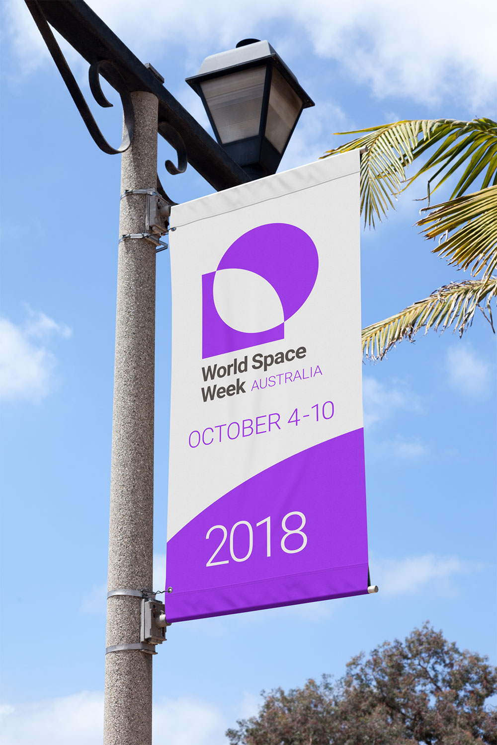
We worked closely with the WSWA executive committee to channel their vision into a simple, elegant, bold new mark that gracefully suggests the organization’s core values of inclusivity, synergy and the union of humanity and space across cultures. The unexpected choice of electric purple communicates power of a regal order and is a distinct breath of fresh air and innovation amidst of sea of black and blue swooshes saturating the space sector. The boldness of its color and form communicates the WSWA’s boldness as a global organization. In order to ensure the global consistency and power of the brand as it expands, we created easily accessible digital brand guidelines creating a foolproof usage and titling system so all countries (82 and counting!) and organizations can create their own unique, yet brand-consistent version of the WSWA logo – uniting all countries under this strong emblem of intergalactic exploration and appreciation.